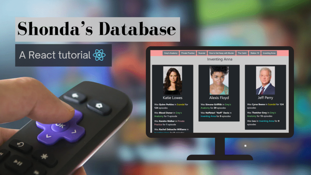
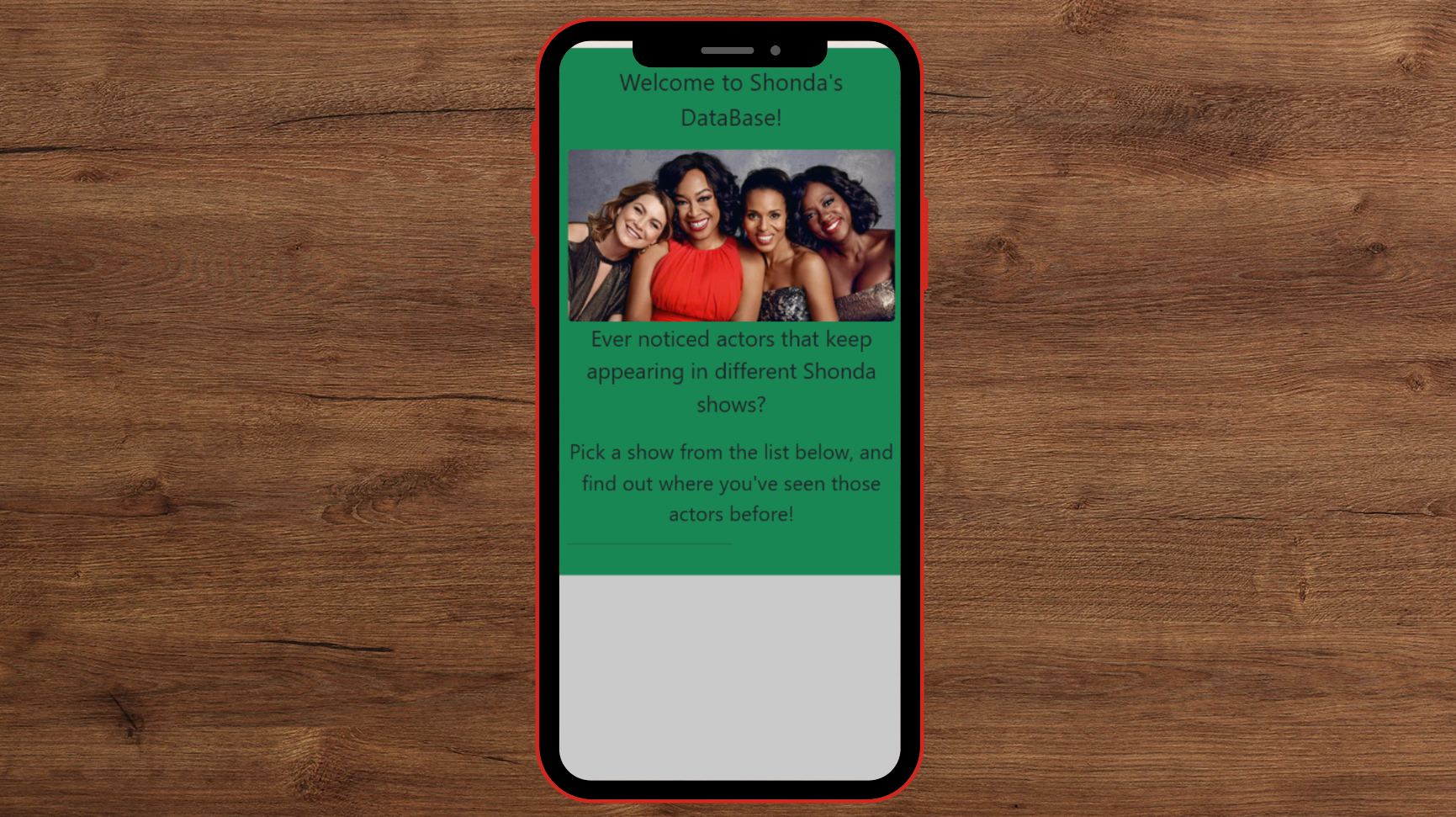
One day, while re-watching Scandal, I noticed Penny from Grey’s Anatomy – and it got me thinking. Of course, every Shondaland fan knows the obvious recurring actors: Meredith’s dad is Cyrus Beene, Leo is Cooper from Private Practice, and so on.
However, what really fascinates me are the ones who slipped under the radar – the actors who started with blink-and-you’ll-miss-them roles and later became major characters in other shows. It truly feels like a perfect “There are no small parts, only small actors” moment, where a brief appearance turned into something much bigger.
Because of this, I built a website to explore it! Given a show, it lists its actors and all the other Shondaland roles they’ve played – a little mix of curiosity, fandom, and code.
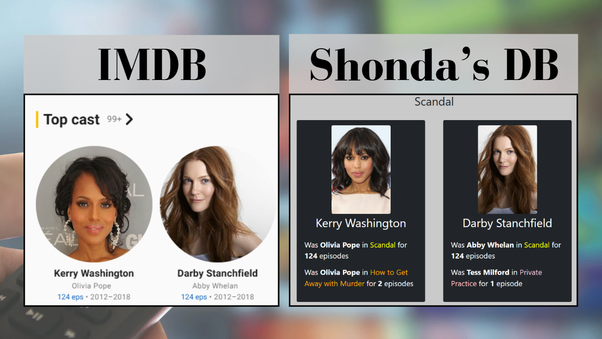
You might think it’s information that is already available to you in IMDB — but in reality, that is not accurate. On IMDB, a TV show page will show you the list of actors, and an actor page will show you the list of shows they acted in. In contrast, on Shonda’s DB, a show page will present a list of actors and their roles in Shondaland on the same page.
This blog post will show you how to create Shonda’s DB website — but the cool part is that you can take it anywhere you want! Maybe there is other data you want to present?
This project has two parts: In the previous blog post, we created the API server, which returns JSON objects with the interesting data. Today we will bring this data to life 😀
Requirements
The possibilities are endless — however, this is the list I ended up with:
- An introduction section explaining the website.
- A closed list of shows the user can choose from. By the way, this is a good place to apologize to all the Bridgerton fans — I love that series as well, but I don’t remember any overlapping actors with the other Shondaland shows.
- A dynamic section containing the show title and actor cards.
- Actor cards: Each actor card is composed of an image, name, and a list of roles: character, show, and number of episodes.
- Filter out actors that only appeared in the chosen show (because we are interested in the recurring actors).
- Responsive website: Desktop, tablet, and mobile views.
If you are like me and usually find CSS frustrating, you’ll be happy to learn that in this project, the CSS was simple to work with thanks to Bootstrap!
Shall we begin?

Project Setup
React
I’ve covered introduction to React previously, so follow the steps here if you need help.
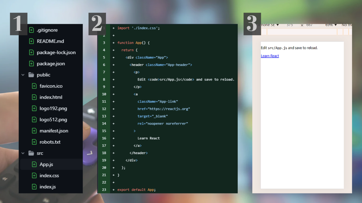
In the screenshots below, you can see how your project is supposed to look after a successful setup:
- The project directory has:
.gitignore,README.md,package-lock.json, andpackage.jsonfiles./public/dir with react stuff./src/dir with react stuff.
2. The middle screenshot shows the App.js file — that’s our entry point!
3. The screenshot on the right shows the application running in the browser (using the command npm start).
Note that throughout the blog post, I will be working on the mobile view. I can tell you it’s because that’s the most common view, but to be honest, it’s just because it’s comfortable to work with when opening the developer tools. Regardless, the project will not be considered done before it’s adjusted to all views.
Bootstrap
We’ll start with installing: npm install bootstrap@5.3.3. Bootstrap is making CSS easier: You use predefined class names for common CSS options, for example: w-50 for a width of 50% and m-1 for the margin. When you need a more specific CSS (there is no w-40, for example), then you can add it to the CSS file directly, like you would do without any framework.
You’ll notice an addition in package.json:
...
 "dependencies": {
    "bootstrap": "^5.3.3",
...
Lastly, you’ll need to add it to the index.html:
// public/index.html
...
<head>
  ...
  <link href="https://cdn.jsdelivr.net/npm/bootstrap@5.0.2/dist/css/bootstrap.min.css" rel="stylesheet" integrity="sha384-EVSTQN3/azprG1Anm3QDgpJLIm9Nao0Yz1ztcQTwFspd3yD65VohhpuuCOmLASjC" crossorigin="anonymous">
  ...
</head>
Now you have Bootstrap in your project!
The Introduction Section
App.js
The first step is cleaning the App.js file, adding a container and an intro component:
// App.js
import './index.css';
import Intro from './components/Intro';

function App() {
  return (
    <div className="container-fluid p-0">
      <Intro/>
    </div>
  );
}
If you are wondering why the div has this class name, I created a demo showing the different classes:

In the introduction, you can write whatever you want, and control the sizing of the text with the class name fs:
– The green background color (bg-success) is temporary, used as a trick to see the borders of this component (more background colors can be found here).
– You might find it odd that earlier I removed the container padding using p-0 (in App.js) and now I’ve added component padding with p-3. The reason is that I prefer the container to be a clean slate, rather than having to balance the padding against it throughout the project.
– The horizontal rule (<hr/>) is a creative choice 🙂
index.css
I removed the default configuration and added the below:
body {
  background-color: #cacaca;
  width: 100%;
}

img {
  width: 100%;
}
– Note that if you want a more rounded border for the picture, you’ll need to replace the inline className=”rounded-3" with a border-radius property in the image’s CSS selector.
– The image width: If we skip this property, the image size will default to the real image’s size (which is too big!). width: 100%; is limiting the size to the width of the screen.
– You might wonder why I don’t use the inline w-100 class name I introduced before. That’s because I’m using the CSS file for global and default configurations: all the pictures should be at 100% screen width (unless chosen otherwise).
Once we have made those changes, here is our introduction page:
The Shows Menu
The goal here is to have a list of shows the user can pick from and see actors from those shows. This means the section will change when a different show is chosen. To achieve that, we will use React’s useState hook!
The structure is as follows:
const [show, setShow] = useState({showId:"1416", showName:"Grey's Anatomy"})
The variable show contains two properties: showId and showName. showId will be used in the API call later. You can leave this property empty for now if you want. The set function setShow lets you update the state to a different value and trigger a re-render. We will initialize with “Grey’s Anatomy” because why not 🙂
Buttons
The next step is to create buttons for the shows:
<button type="button" className="btn btn-lg btn-secondary m-1">Scandal</button>
I like the class name className=”btn btn-lg btn-secondary m-1". In case you are curious, here are buttons with different class names:

For the button to be doing something, we need an onClick function! We want the button to change the value of the show variable, therefore:
onClick={()=>{setShow({showId:"39269", showName:"Scandal"})}}
And to ensure it’s working, we will add a paragraph presenting the current show: <p>show is: {show.showName}</p>
Once this works, you can add the buttons for the rest of the shows:
After all that, this is what we end up with:
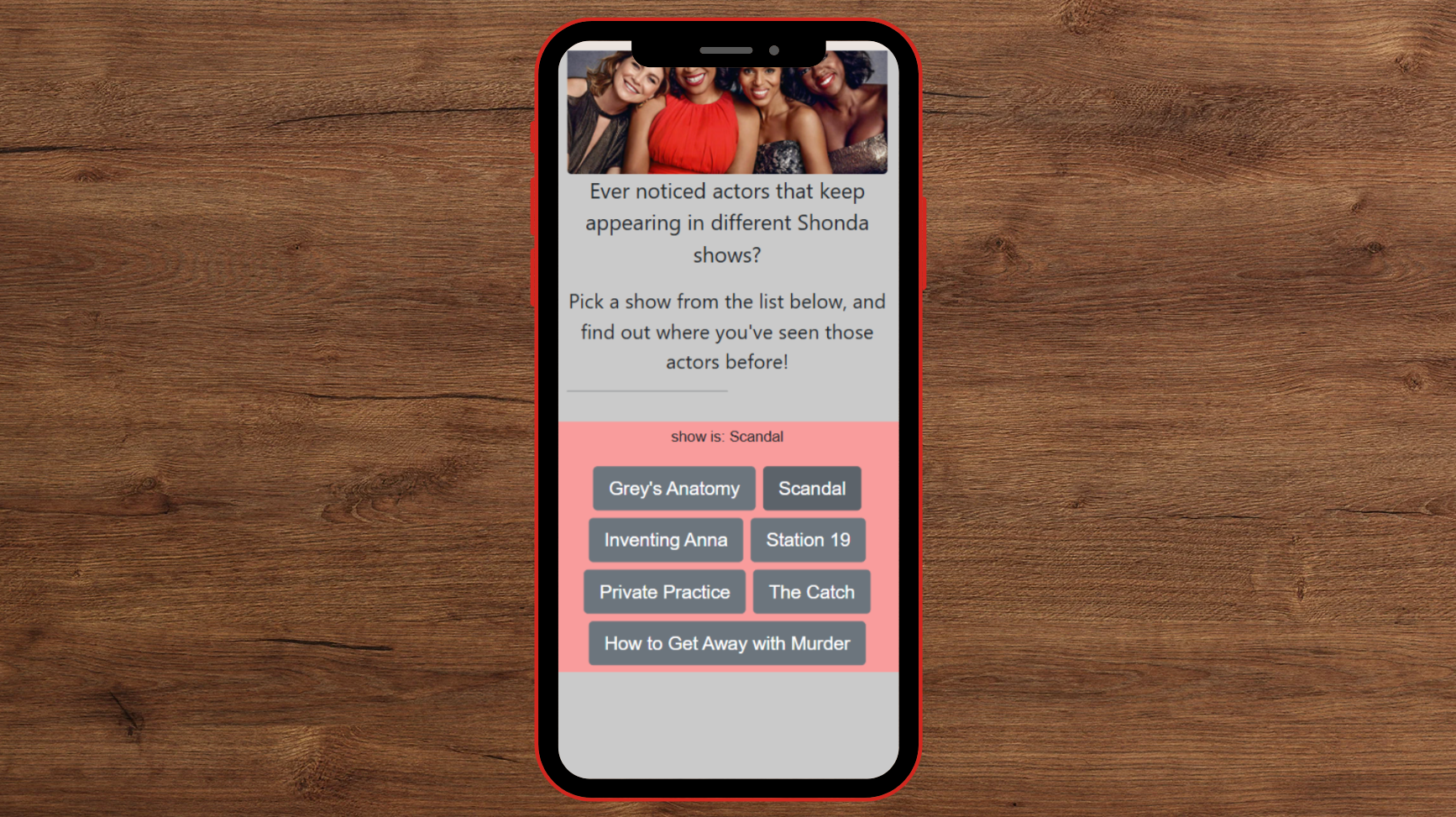
Notice that when you click a button, the paragraph (<p>show is: {show.showName}</p>) will change!
By the way, I removed the green background from the introduction section at this stage — we are going with a grey-peach combo!
This Can Be Improved
The code above isn’t exactly pretty. Those copy-pasted buttons should really be generated in a loop – but we need something to loop over!
Let’s create a constants.js file and a new dictionary:
Now we can simplify show to be just showId , and instead of show.showName we’ll use SHOW_ID_TO_NAME[showId]:
Now we can replace the buttons with a loop:
...
{Object.entries(SHOW_ID_TO_NAME).map(([id, name])=> (
    <button type="button" className="btn btn-lg btn-secondary m-1" onClick={()=>{setShowId(id)}}>{name}</button>
))}
...
Lastly, this should be a separate component. But how can we do that and force the app to render from within a child component? By passing the set function!
This is how App.js will look like:
And the code block will move to a new component:
Now the code is beautiful!
Meme break!

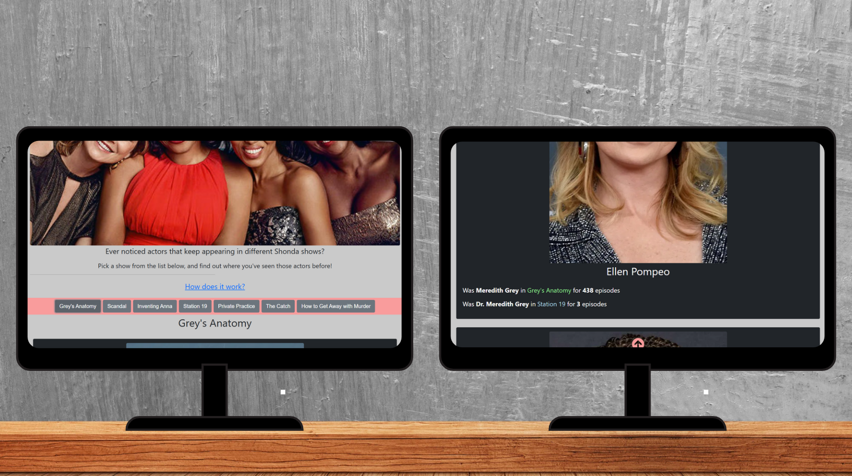
Actors List
This is the juicy part! Once the user chooses a show, we want to present the list of actors from that show!
For this, we will use the API we’ve created in the previous blog post: https://shondasdb-api.netlify.app/.netlify/functions/get-top-cast-for-show/SHOW_ID
We’ll start by going over the response structure, and then show how to make the API call and use the data received.
The API Response Structure
The response has two properties: cast_ids and cast_data.
– cast_ids obtains the order of actors, which is based on episode count.
– cast_data is a dictionary. The key is the actor’s id, and the value contains the information we are interested in, about each actor: name, image, and roles in Shondaland.
– Each role has the following information: character name, episode count, and show name.
– There is also a general total episode count, but thinking of it now, it has no use, and I’ll probably remove it in the future.
So this is what we are working with:
Fetch The Data
At this point, we’ll introduce another React hook: useEffect. This hook allows a component to synchronize with external systems (which in our case is the API). The structure of the hook is useEffect(setup, dependencies?) (? means optional).
Adding a fetch in our code will look like this:
– First, we start by fetching the API and reading the response as JSON.
– Next, we save the properties of the JSON to variables: actorsIds and actorsDetails. We use the useState hook for those.
– Keep in mind: we add the show as a dependency of the hook because we want this code to run every time a different show is chosen.
Finally, now that we have the data, it’s time to present it!
Actors Container
We’ll start by adding the new component to the App.js file. Note that we want to show this component only when we have the actors’ data, so we will use the condition: {actorsIds && <Component>}.
You can use actorsDetails as well, because they are both initialized with null until populated.
The ActorsContainer component will contain the show name and the list of actors. The Actor component will contain the information on each actor. The order of the actors will be determined by the actorIds array. Let’s see it in the code:
Remember that every element in the loop needs a unique ID, otherwise, you will get the error: Warning: Each child in a list should have a unique "key" prop. Therefore, I added to each Actor element key={id}.
We didn’t finish with this component, but to continue, we need the Actor card!
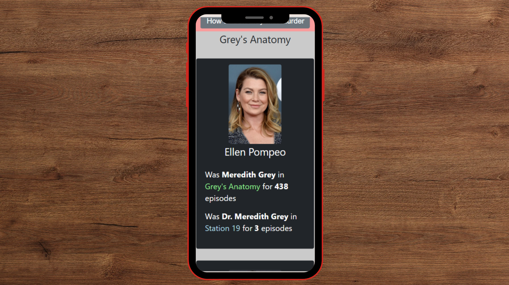
Actor (Card)
This is the component in which we present the actor’s details: name, image, and roles. The roles will go in another component, so we’ll cover them in the next section.
– The image link is received from TMDB’s API in a format that includes just the image name. To reach the image, we need to add it as a suffix to the link: https://image.tmdb.org/t/p/w500/IMAGE_NAME. Therefore, the image src will be src={imgPrefix + actorData.profile_path} , where const imgPrefix = “https://image.tmdb.org/t/p/w500".
– I wrapped the div with {actorData && …} to ensure we don’t try to reach properties of the actorData variable when it’s undefined, and break our application.
– className=”p-3 m-3 bg-dark text-white rounded-3" means padding, margin, dark background, white text, and rounded corners. See why Bootstrap is so fun to use?
– It’s worth noting that for padding, the bigger the number is, the bigger the padding, but for font size (fs) — a bigger number means a smaller font.
Time to display the actor’s roles!
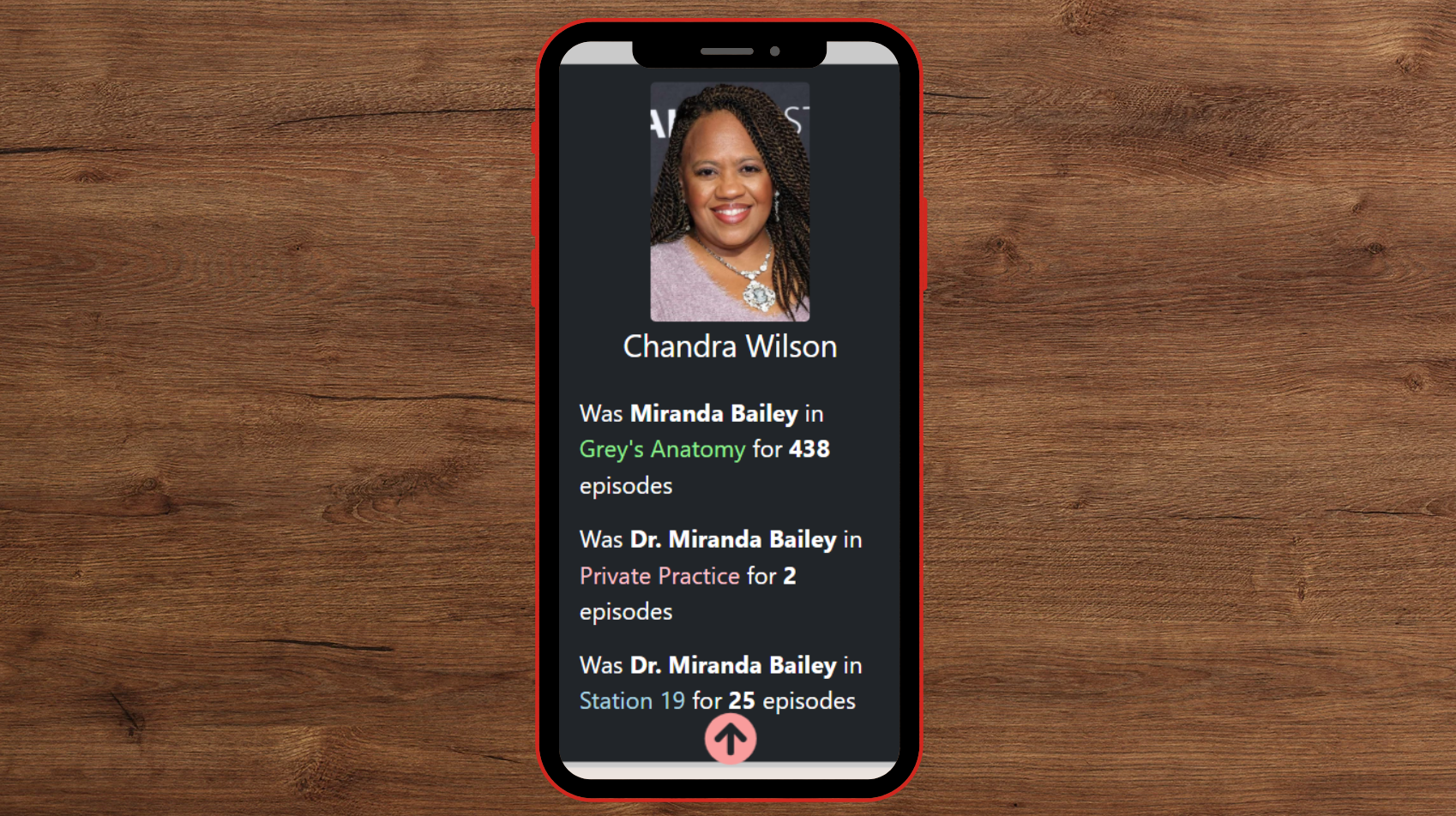
Actor Roles
A disclaimer: this could’ve been a much simpler div, but I decided to use span elements so I could add color and weight to the text.
In the new component, we’ll loop over the roles:
– Make sure that if the episode counter is equal to one, then it will be followed by the word “episode” and not “episodes”.
– Because every element in the loop needs a unique ID, and characters might appear in two different shows, I added to each div element key={role.character+role.showName}.
For coloring the show names, I created a dictionary in the constants file:
Look how beautiful it turned out:
Filter Recurring Actors
Before moving on to the next section, let’s filter the actors list so we don’t include those who appear only once. Since the goal of this website is to highlight recurring actors, we can skip those whose biggest Shondaland role was “blood donor 1” or “police officer 3”.
We’ll go to ActorsContainer and filter the actorsIds array. An actor is considered recurring if they have more than one role. Then, we’ll make sure to iterate over the new array: filteredIds.
Meme break!

Adding Cool Features
Although they weren’t in the original feature list, there are a few things that will make our website cooler. If you are not interested in those, you can continue to the “make the website responsive” section.
Scroll-Up Button
When I think about the user experience, I notice that once someone scrolls down through the list of actors, there’s nowhere else to go. While I could add pagination controls like “Previous” and “Next”, the site already retrieves 50 actors before filtering, which is sufficient.
A better user flow would include a scroll-to-top button that appears once the user scrolls down. This way, they can easily return to the top and explore other shows on the site.
To address this, I found a tutorial online and made some tweaks. I will use the same component, ScrollButton:
– This component is using react-icons and therefore requires npm install react-icons.
– The tutorial introduces a components/Styles.js component and uses the “styled-components” library, but those aren’t required here. I’ll update the CSS file instead:
Lastly, we will add the scroll button to App.js:
This is what it looks like:
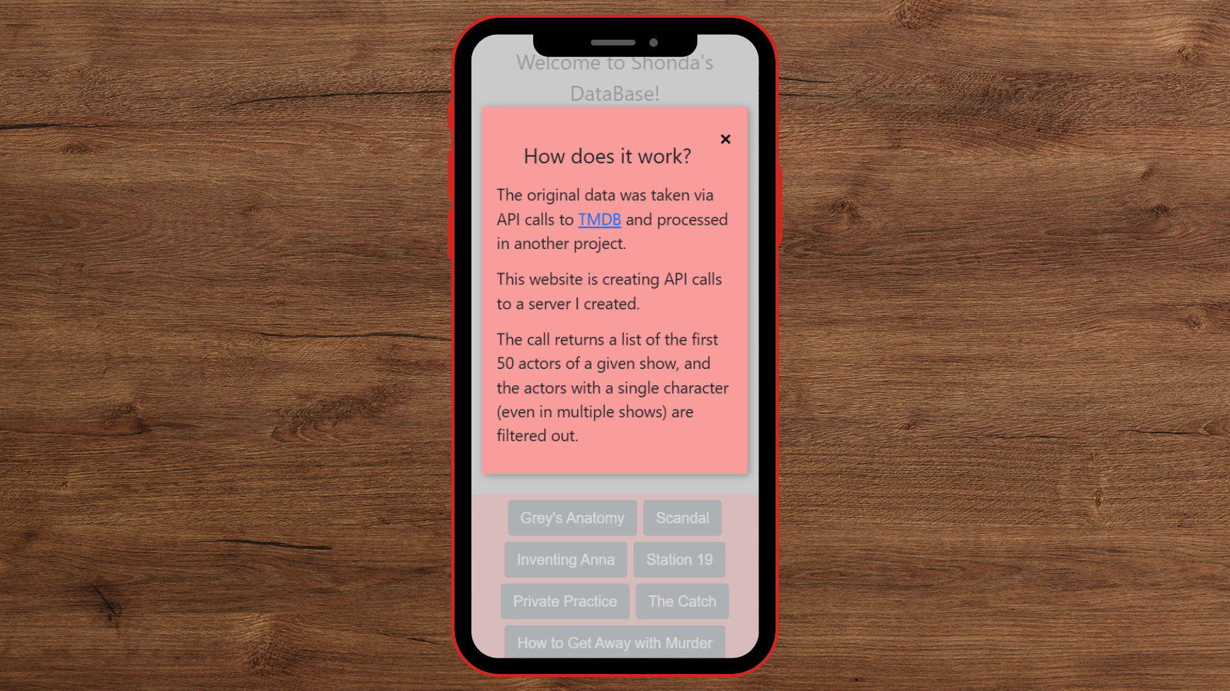
Information Modal
I thought it’d be fun to include a little “extra info” section – things you don’t need to know, but might find interesting, like the data source or how many actors return from the API call.
We’ll start by adding a new modal component, which contains two parts: the close button and the text. The button’s function will be set outside of the component, for the functionality to work (we did something similar with setShowId).
– Note that we don’t use x , but × because it looks better (it’s the code for a multiplication sign).
The next step is to modify Intro.js:
– We are adding a button suggesting further information.
– Below that is the new modal. Note that we initialize it with ‘false’.
Lastly, we’ll add some CSS magic:
This results in:
Make The Website Responsive
Enough with the mobile view! Let’s make sure our website is gorgeous in every window size!
This is our starting point:
As it is now, the view is the same structure as a mobile view. There are two changes required:
- Image size (both actors and main photo)
- Add columns in the
ActorsContainercomponent
We’ll create different configurations for different screen sizes by adding a responsive section in the CSS file:
...
@media (max-width: 600px) {

}
Image Size
Starting with the main picture, we’ll set the desktop view to be 30%, and the mobile to be 100%:
Note that we don’t override the border-radius property, so it will stay 5px.
For the actors, I find it best to set the images to a fixed 200px width. We’ll set the actor image with the class name (<img className=”actor-img”...) and set the width in the CSS file:
...
.actor-img{
  width: 200px;
}
Keep in mind that we could’ve used ID as well, considering there is only a single element using this. But everything else in the CSS file is a class, so I’m going with a class.
Adding Columns
There is a trick here! We don’t need to set up columns explicitly, just to ensure the actor cards are in a smaller width. This means that if we want 3 columns on the desktop view, we need the actor card’s width to be 33%.
To get started, we’ll go to ActorsContainer and wrap the Actor component in a div, and give it a new className:
That way, we will have a grey background in between the actor cards!
Next, in the CSS file:
I’ve added another width of 2 columns for when the window is smaller than a desktop but larger than a mobile.
Modal Size
Lastly, if you added a modal in the previous section, you’ll need to make responsive modifications: 25% top margin does not look good on desktop view.
Upload to Netlify
After all this effort, we don’t want the project to just sit locally. Let’s put it online! Here’s how to upload your site to Netlify:
- Create a Netlify account if you haven’t already.
- On the website, click “Add new site” and choose “Deploy manually”.
- In your project (on your computer), run the command
npm run build. This will create a/build/directory — this is the directory you upload to Netlify.
Finally, we finished our website! The vision has come to life! If you have ever suspected recurring faces in Shonda Rhimes’ shows, now you can easily check if that hunch is right!
Here is my website: https://shondasdb.netlify.app/, and I would love to see yours! 😀